Boosting cashback efficiency in Vivid Money
Cashbacks have been the main acquisition tool at Vivid Money since the beginning. It was crucial to find the balance between the amount of rewards customers get, their satisfaction and the business outcomes. I led design efforts in the product and UX experiments on this path.
Product

Vivid Money
Role
Senior Product Designer
Scope
Product strategy, UХ/UI, user research, 0-1
Years
2022-2023
Platform
Mobile
About company
Vivid Money is a fintech startup with 500K customers all over Europe, based in Berlin. Vivid combines financial services, lifestyle features and investments in one app. As a young company, Vivid is constantly experimenting with the product balancing business and customers' needs.
Product & users
Combining classical financial services, lifestyle services and investments, Vivid offers its' clients various ways of growing their money. Vivid users are those who wish to spend and save money wisely, interested in investments and value high quality of digital craft.
Context & problems
Vivid was investing in generous cashback offers to attract customers. However, the users didn't engage in the app enough or churn soon so the customer lifetime value wasn't high enough. The goal was to increase the efficiency of the cashback system by improving the UX and building user habits.
Use case: I want to shop online and smart.
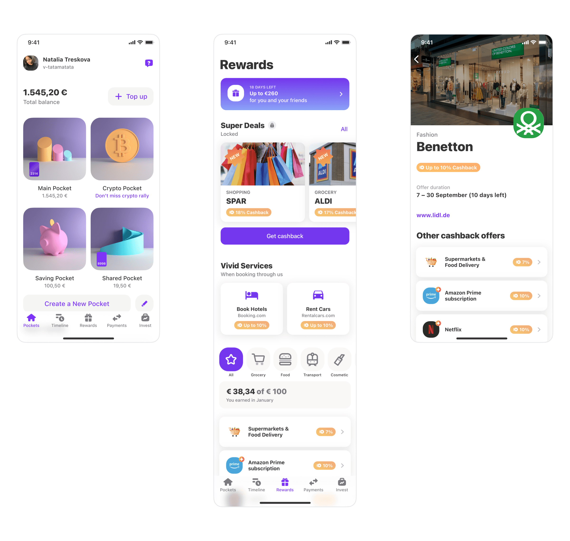
From the beginning, our customers have been used to great cashback offers:
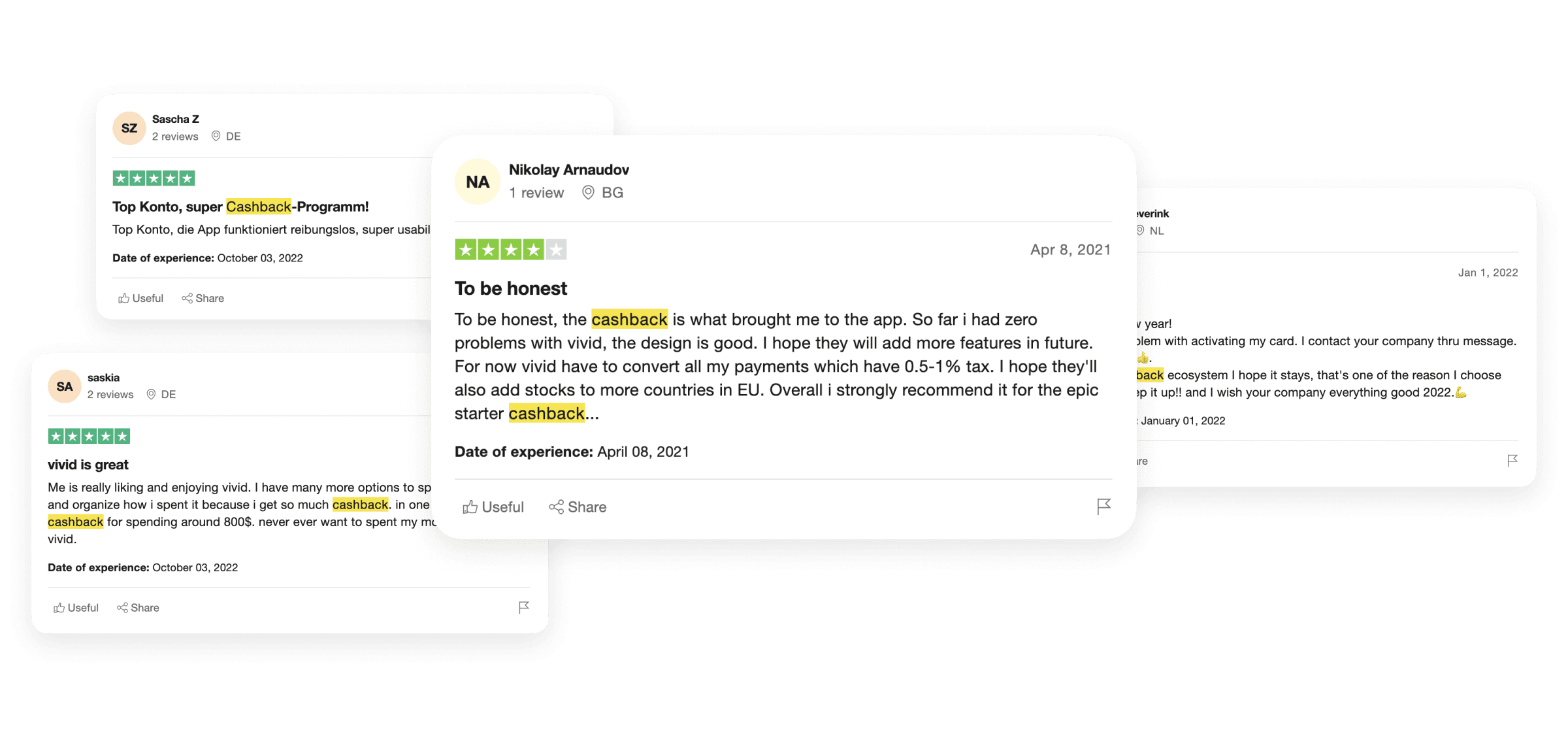
The point A was:
Team and my role
I was responsible for the product design work in the cashback and lifestyle services experiments. On this path I actively collaborated with several product teams and Vivid founders.
Improve scalability
Poor offer structure
The first cashback problem I worked on was the poor structure of a cashback offer. Offers usually had additional conditions for getting the cashback, but users could easily miss them. As a result, they contacted the Support with questions or claims.
At the same time the product teams struggled to launch cashback experiments as the offer structure wasn't scalable for changes. In addition, there was no standard for promoting Prime within the offers.
To solve this, I created a screen template for all types of cashback offers:
✧ Users
Get a convenient place with easy-to-find information about the offer.
✧ Business
Gets an efficient instrument for product experiments + Prime promo.
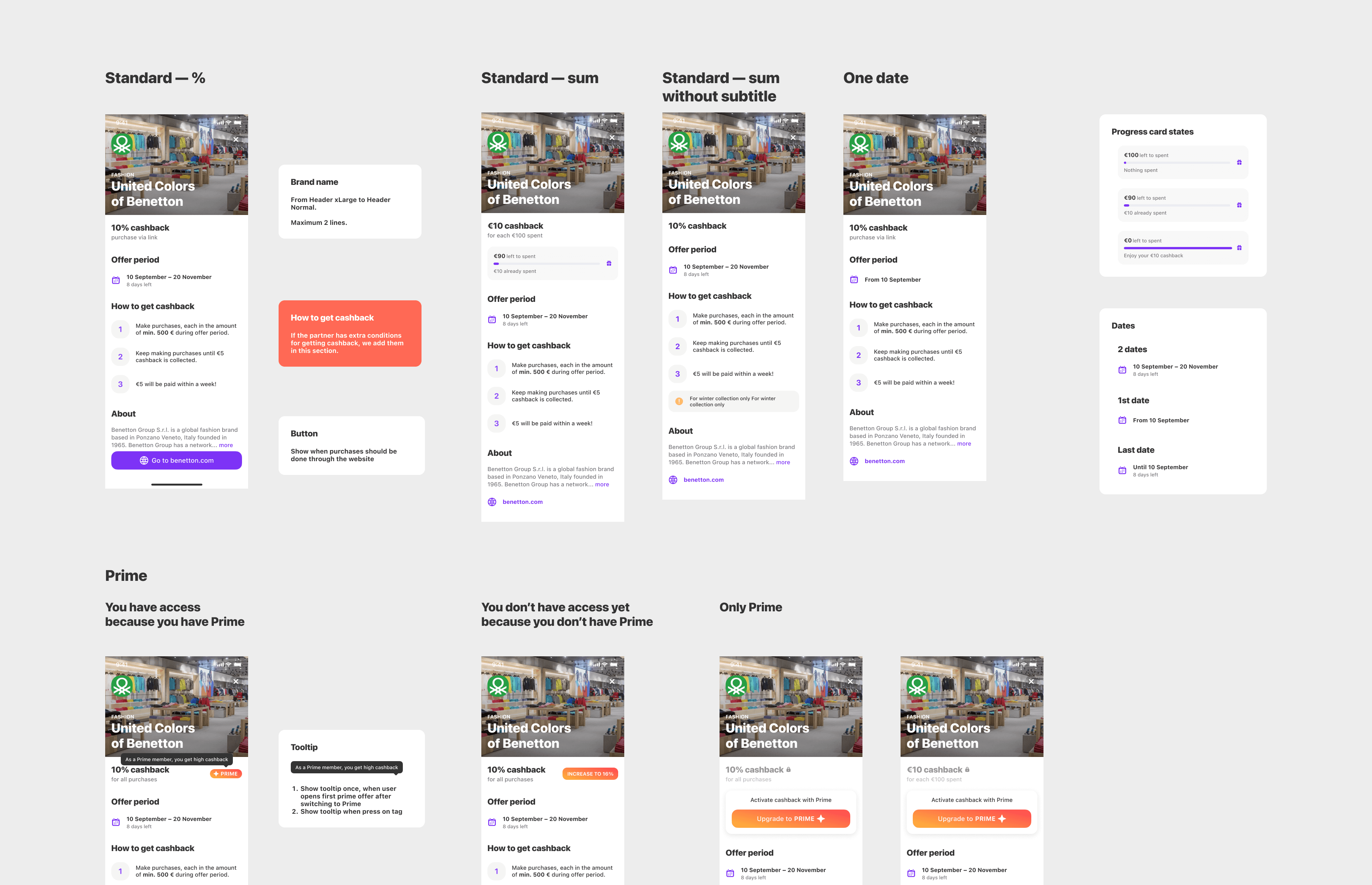
I have taken into account various nuances. For example, previously photos for offers contained shop facades and didn't promo the brands and the goods. With the new template we changed the images to better show the brand products.
As a result, the amount of requests in Support about cashback has decreased and the team gained an efficient instrument.
Form a habit
Shopper
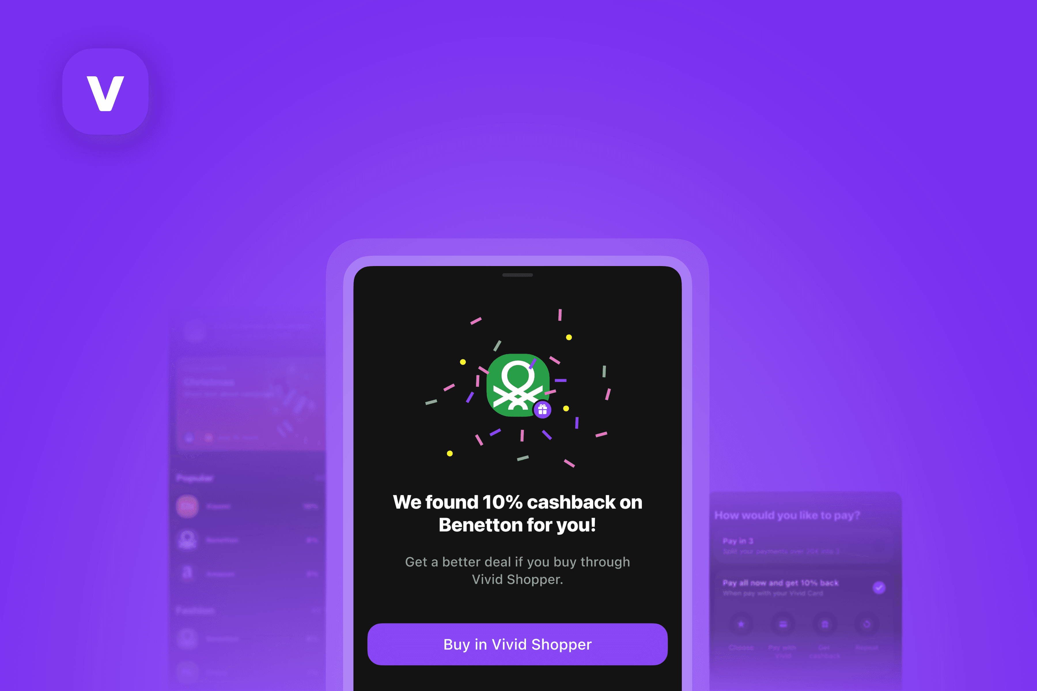
The first big product experiment within the cashback space was Shopper — a shopping hub inside Vivid. The goal was to switch from occasional cashback wins to forming a shopping habit inside Vivid. The product ideas behind Shopper were the following:
✧ Buy
Find your favourite shops inside Vivid and make purchases inside the app.
✧ BNPL
Buy now or pay later by splitting the payment in 3 parts.
✧ Get cashback
You always get cashback when you pay with Vivid card. For some brands you get extra cashback for buying inside the app!
✧ Shopping habit
Shopping at Vivid is easy, safe and more convenient than at other alternatives.
The key metrics:
Penetration in in-app offers: offers which are only activated when user makes a purchase inside Vivid app. These offers were profitable for Vivid.
Overall number of purchases with Vivid cards.
Amount of split (BNPL) purchases. Profitable for Vivid.
For the first iteration, I added Shopper on the Rewards feed among other rewards-related programs. Shopper included both cashback offers (100+) and websites of non-offer brands with default Vivid card cashback (700+).
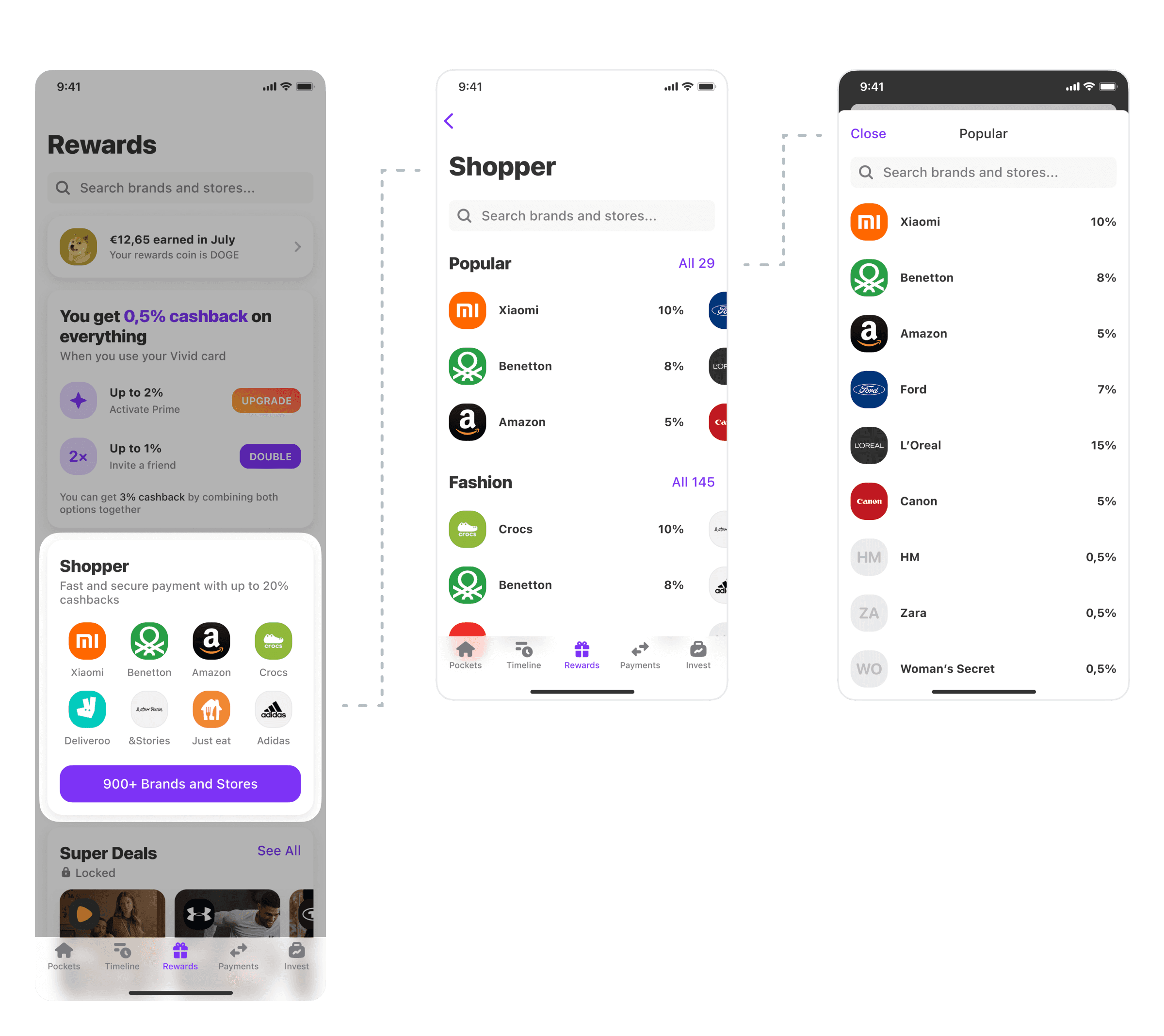
As we were experimenting at Vivid almost all the time, the Rewards tab was not static. For example, while working on Shopping UX I was also working on converting rewards bonuses into crypto coins and another designer was working on Vivid card default cashback.
To make a purchase, the user had to open the brand website via webview in Vivid app.
I suggested several features for a smoother UX: card credentials available at any moment and custom suggests on checkout. The service was new to our users and I aimed to reduce the friction.
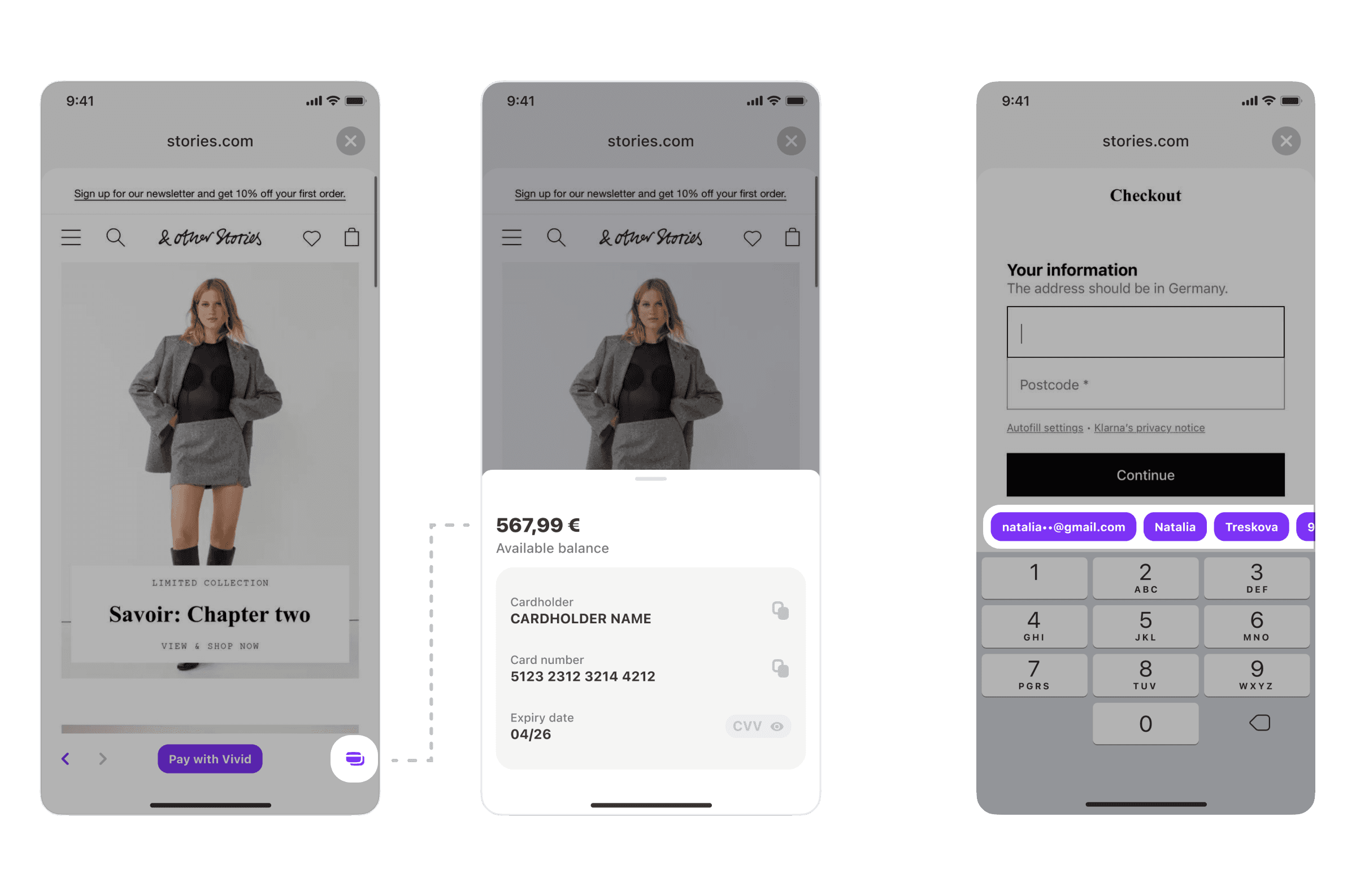
The overall flow contained several logical branches:
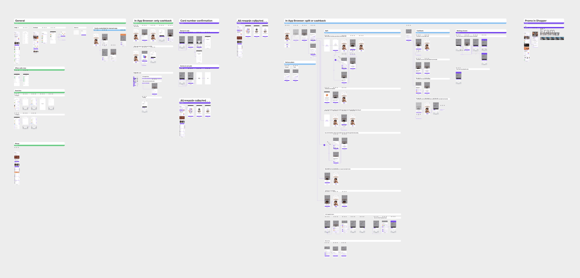
The main idea is: Vivid is more than occasional cashback. Vivid is for online shopping in general.
The 0-1 Shopper launch proved that the product has a potential. The next step was to switch from "cashback" to "shopping" model and to drive the engagement.
After a series of strategic brainstorms with the product team and the stakeholders I started exploring the design options. To get more insights, I observed various superapps and BNPL services. The challenge was to combine online and in-store offers plus other rewards programs together plus BNPL.
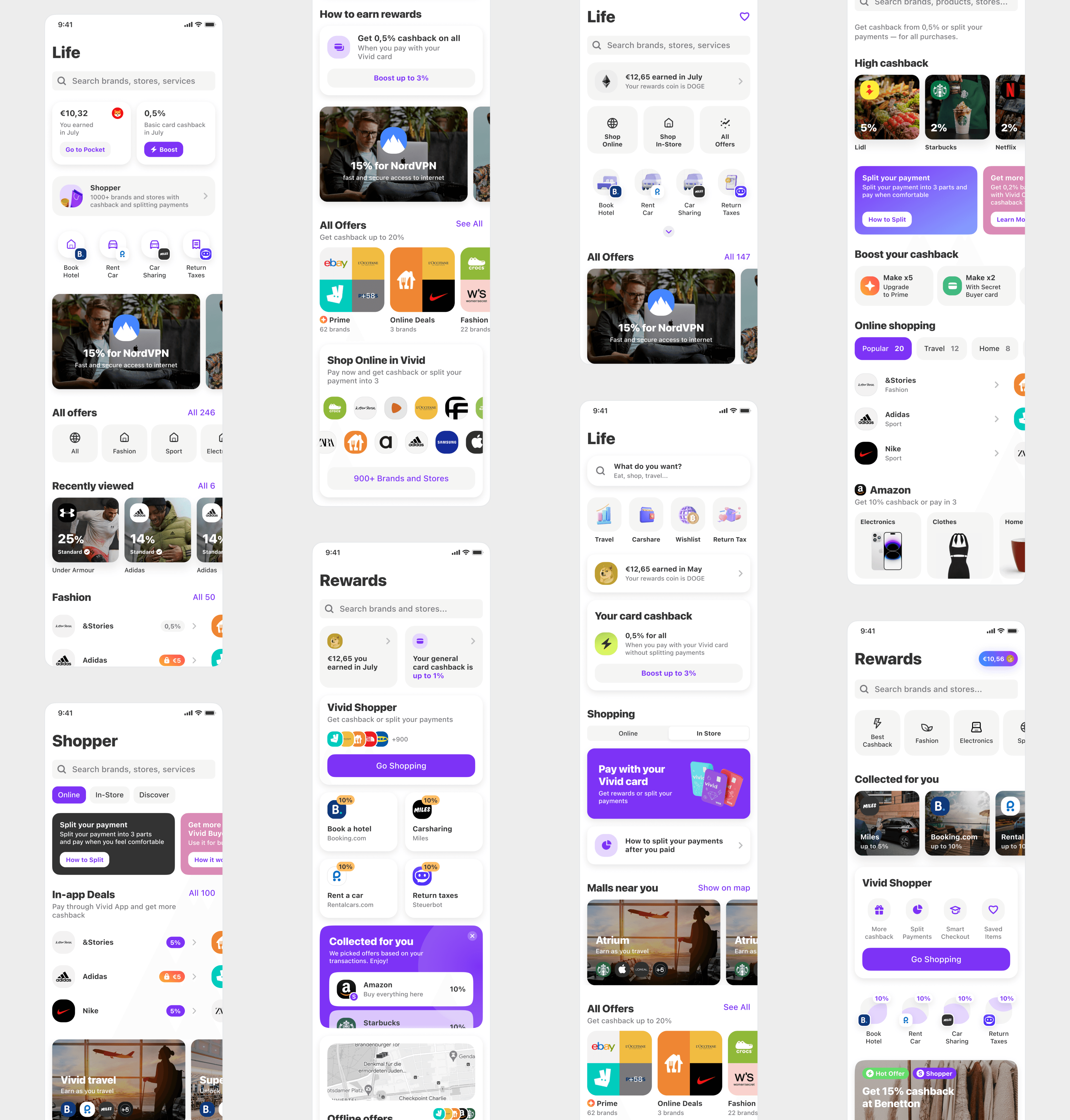
Next iteration
Finally, I've come up with the following variant:
✧ Scalable
Instead of a major redesign, I offered to create a scalable system for conducting targeted experiments.
✧ Simple
No unneeded changes which might overwhelm the users (we had already seen such feedback).
✧ Focus
Focus on the shopping process, the variety of brands, and shopping related UX instead of fast rewards.
✧ Reverse logic
Not a widget on Rewards tab. The whole tab is Shopper now and all the brands are on the first screen.
To drive the Shopper adoption and form a habit, I prepared the product discovery experience. The PMs had hypotheses about specific brands and contextual offers, so I designed various triggers for testing.
For example, the most popular screen after Main was Timeline and we conducted several tests with different contextual banners on it: "You made a purchase at EasyJet, would you like to book a hotel at Booking.com with 10% cashback?".
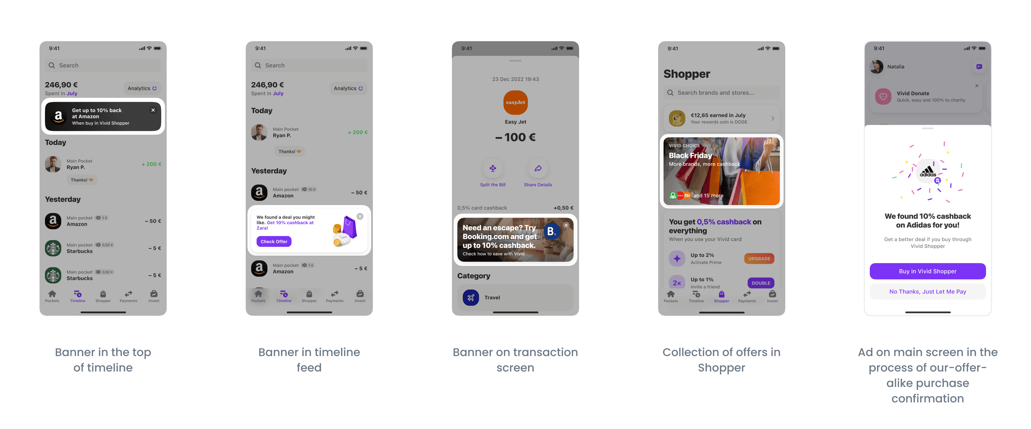
Result & learnings
Shopper helped to 2.5x increase the penitration in in-app offers. Pretty cool — but less than we wanted. Additionally, we faced following problems:
There were UX frictions because of legal and technical issues → To fix them, we needed significantly more resources and changes in the business part.
The company cancelled the default card cashback → The majority of brands stopped offering cashback.
Key learning:
Users had strong favourites among the cashback brands (like Amazon and eBay).
Strategic decision: focus on cashback program and pause the split payments opprotunity.
Next iteration
Simplification & personalisation
Together with the PMs, we analysed the Shopper results and decided to focus on cutting unneeded costs and delivering a more personalised experience to the users regarding their cashback brands preferences.
After brainstorming, we've come up with the following concept:
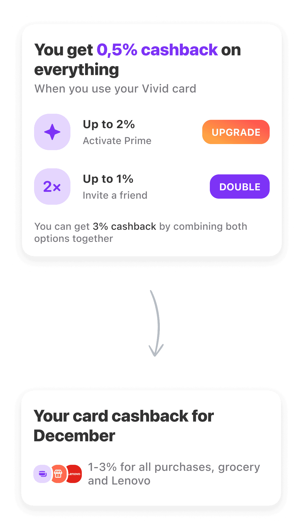
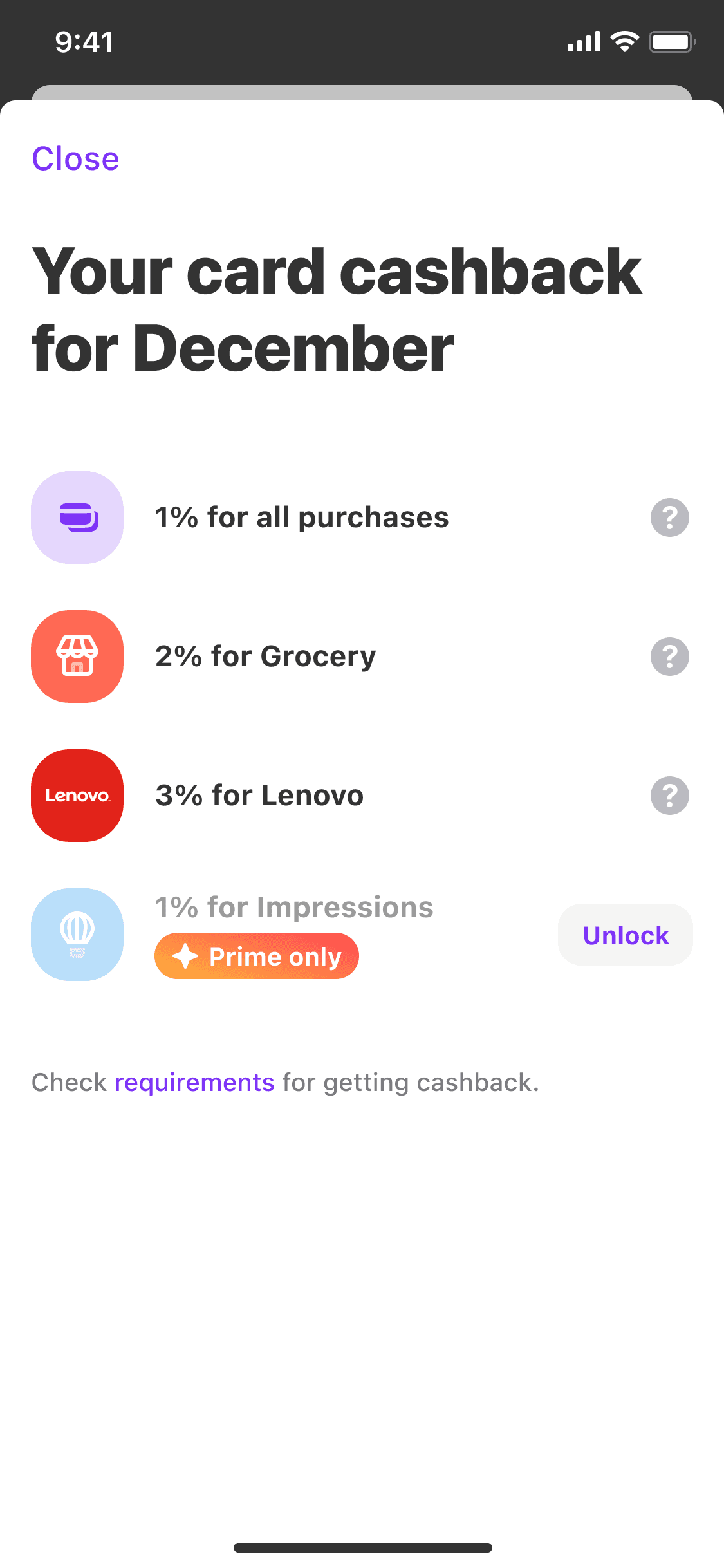
Replace default card cashback (for all card purchases) with monthly cashback categories & brands.
Promote Prime plan by giving extra categories to paid users.
This approach could let us form a user habit, drive the engagement, and cut costs.
Users were already overwhelmed with frequently changing cashback UX, thus I made the flow as simple as possible. I've added a CSAT survey to gather data about users' preferences and to offer to them optimal cashback categories in the next month.
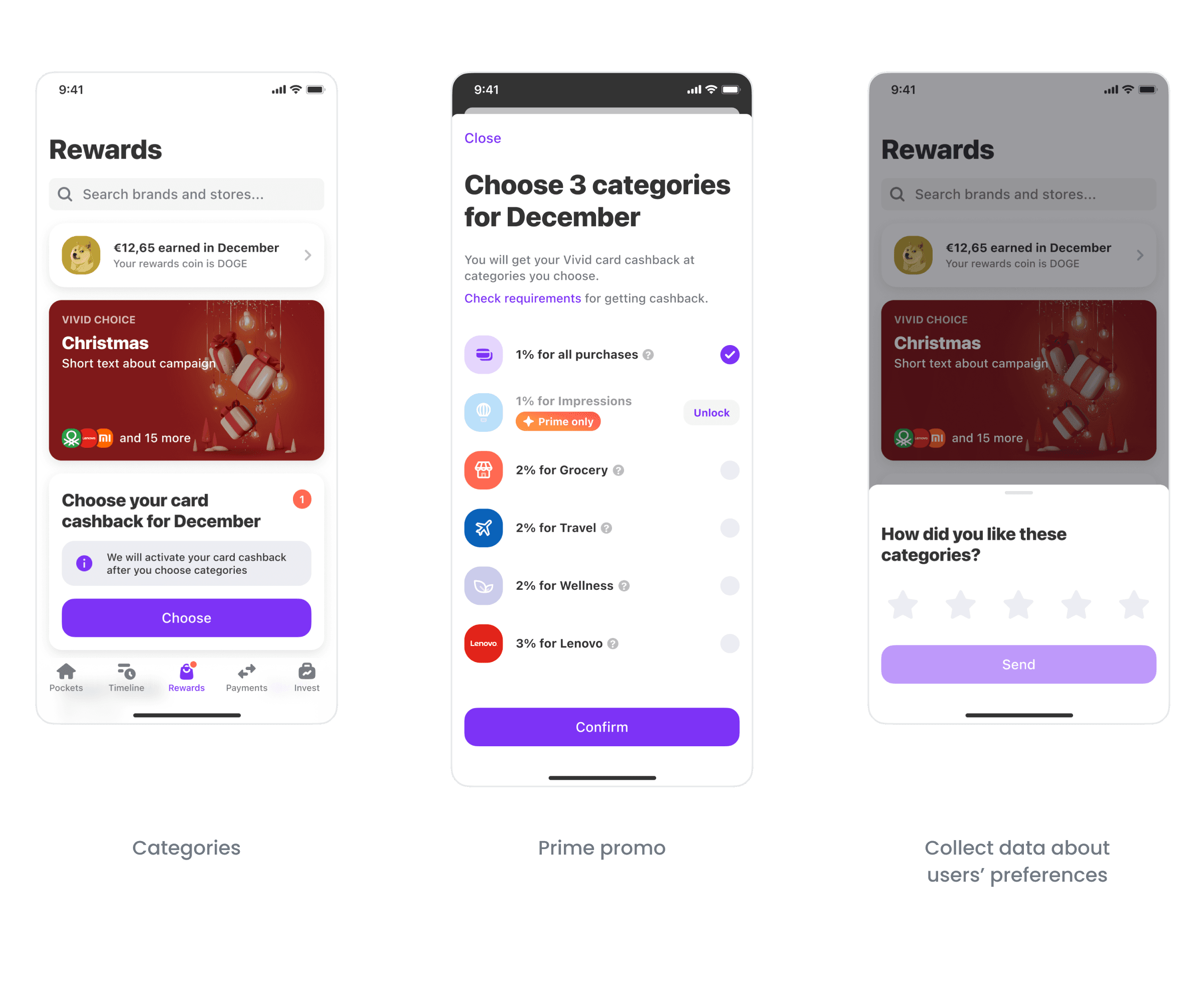
Result & learnings
This approach turned out to be successful:
Costs on cashbacks were reduced 2x maintaining the same level of users' satisfication.
Cashback improvements were instrumental in 30% increase in paid Prime monthly retention.
We collected data regarding the cashback categories users actually loved or not. It helped to enhance the quality of cashback categories for different users' segments.
Key learning:
There were months which we considered very generous in terms of cashbacks offered but the users didn't rate them high. Therefore, it is crucial to study your users with the data.
Outcome
2x
Costs on cashback were reduced with the same level of users' satisfaction.
30% increase in retention
Cashback improvements were instrumental in 30% increase in paid Prime monthly retention.
2.5x
Penetration in in-app offers increased.
Reflections
The power of small steps. Instead of redesigning the whole app I designed a humble first version of Shopper which let the product team conduct multiple experiments iteratively and make data-informed conclusions.
The power of innovations. Although Shopper didn't enhance enough the key metrics it let the whole company to dive deep into the nature of fintech shopping and drove further experimentation.
Strategy above occasional wins. Acquiring more customers offering them too generous rewards might be tempting, but it doesn't lead to a solid connection between the product and the customer.
