Boosting e-shopping in Vivid Money
I have led the end-to-end product design efforts in a 0-1 project of implementing an e-shopping experience inside Vivid Money app. Through iterative experimentation, it resulted in 70% increase in total affiliate purchases and a better understanding of users' needs.
Product

Vivid Money
Role
Senior Product Designer
Scope
Product strategy, UХ/UI, user research, 0-1
Years
2022-2023
Platform
Mobile
About company
Vivid Money is a fintech startup with 500K customers all over Europe, based in Berlin. Vivid combines financial services, lifestyle features and investments in one app. As a young company, Vivid is constantly experimenting with the product balancing business and customers' needs.
Product & users
Combining classical financial services, lifestyle services and investments, Vivid offers its' clients various ways of growing their money. Vivid users are those who wish to spend and save money wisely, interested in investments and value high quality of digital craft.
Context & problems
In 2022 Vivid decided to explore new business opportunities regarding changing economical climate. By that time our users had been already enjoying getting cashback with their Vivid cards, and we thought: 'How can we make this behaviour more engaging and beneficial in terms of business?'. That's when the idea of Vivid shopping appeared.
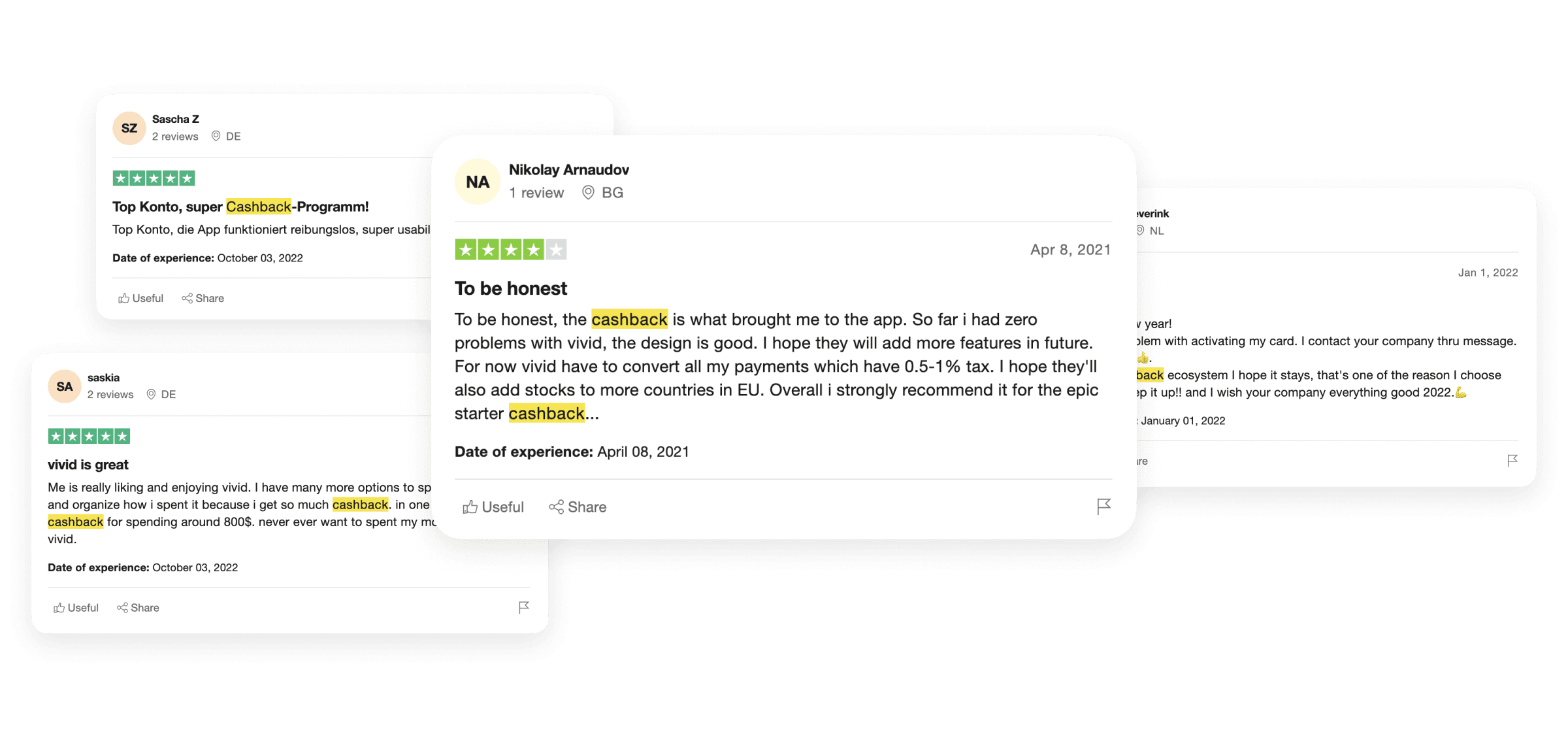
From the beginning, our customers have been used to great cashback offers:
Point A was:

Team and my role
As a Senior Product Designer, I have contributed on multiple levels:
Led design vision and all design hands-on work within the project.
Conducted user research, collected and systemized the feedback.
Collaborated closely with colleagues from cross-functional team.
Took part in design critique sessions with other designers to foster the design consistency.
Facilitated brainstorms with the PO and PMs sharing design vision.
Pitched design concepts directly to the company leadership.
Foundation
Vivid Shopper concept
Use case: I want to shop online and smart.
Main idea: Vivid is more than occasional cashback. Vivid is for online shopping in general.
So, based on what we already have in the app — what can we offer to the users? Together with the PMs and PO, we started brainstorming options of enriching shopping experience based on existing users' feedback and the business goals:
✧ In-app shopping
Find your favourite shops inside Vivid and make purchases inside the app.
✧ Get cashback
You always get cashback when you pay with Vivid card. For some brands you get extra cashback for buying inside the app!
✧ BNPL
Buy now or pay later by splitting the payment in 3 parts.
✧ Secure & convenient
Shopping at Vivid is easy, safe and more convenient than at other alternatives.
The foundation of e-shopping were the affiliate offers:

These offers worked the following way:
Vivid collaborated with a brand. The brand created a specific link on its website for Vivid customers, an affiliate link.
Vivid gave this link to the customers.
Customers started their shopping on the brand website with this link and got cashback.
The brand paid Vivid a fee after a successful purchase — the profit.
Key metrics
The main metric was:
Affiliate purchases → Share of affiliate purchases and total sum of affiliate purchases.
Additional metrics to follow:
Card purchases → Total sum of in-app card purchases.
BNPL → Total fees from split purchases.
First iteration
Research
I started with identifying existing best practices on the market. My goal was not reinventing the wheel, but learning what already works.
At the same time I analysed users' feedback on cashback and saw quite a lot of positive reaction on the whole experience.

Information architecture concepts
For the first iteration, we decided to start with the simplest solution to check whether the initial hypothesis about shopping even made sense. I explored various variants of grouping a large number of stores (900) within a screen. I aimed to show both [1] the best brands we had (e.g. Amazon) and [2] variety of types of brands we had (fashion, travel, sport etc).

In-app shopping
For the first iteration, I added a Shopper widget on the Rewards feed among other programs. Inside it:
Affiliate offers (50-100 for different countries).
Manually added websites of popular brands without cashback, but with BNPL option (700+).
The goal was to see whether users are even interested.

User chooses how to make a purchase: [1] pay now and get cashback or [2] split the payment without cashback. We help to fill the checkout form with smart suggestions upon the keyboard.

First results
We were exploring the users' behaviour and measuring metrics for a month.
Over 10% Rewards users visited Shopper daily.
Total sum of affiliate purchases was growing and the team saw a potential for a bigger growth.
Boosting awareness & adoption
Analysis & brainstorm
The next step was to acquire more users and drive further Shopper adoption.
I facilitated several brainstorm sessions with the Po and PMs to explore opportunities. For these brainstorms, I grouped users' feedback after the first iteration, analysed existing data, and researched targeted UX practices.
Users' feedback grouped by key problems:

I summarised all types of rewards and cashbacks programs we had at that moment:

From the feedback, we saw that users often didn't see the difference between Shopper and existing cashbacks. We needed a unified approach with a focus on forming a shopping habit in Vivid instead of getting an occasional reward.
The company was ready to go bold with Shopper as we saw a potential for a flagship product. Thus I started exploring various approaches of combining existing cashback logic with Shopper including other channels besides Vivid app itself.

At that time we decided to focus on in-app experience. I prepared several approaches and pitched them to the company leadership on weekly product & design sessions. It helped to align design vision with the company strategic plans.
For instance, one of the big decisions I faced on the path: should we merge Rewards and Shopper or find a way to keep them both in the app? I collected information from several stakeholders to analyse pros and cons of each approaches.

Final vision:
Rewards programs → Variety of brands

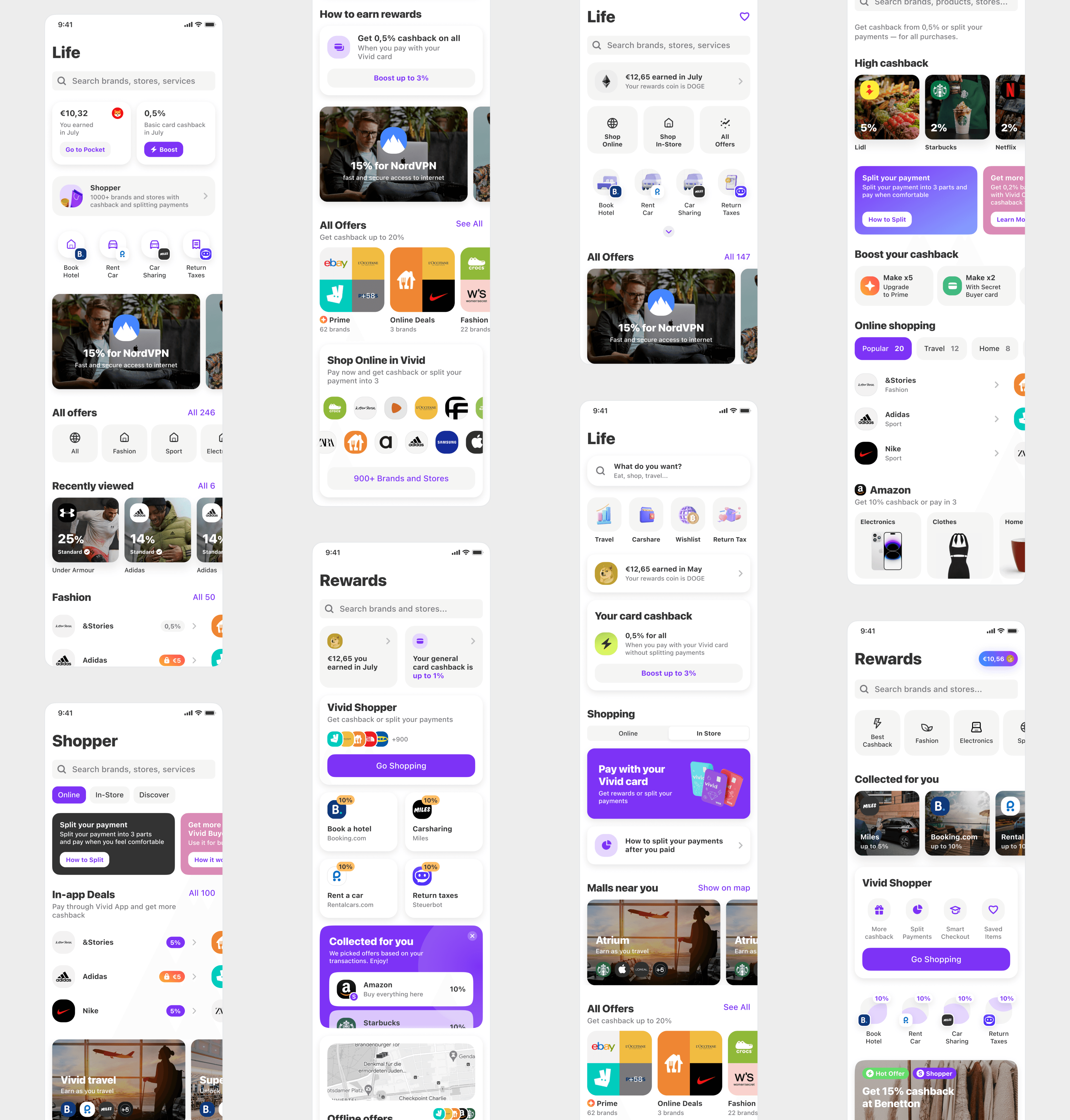
In the final version I merged Rewards and Shopper and used the reverse logic. Previously, on the Rewards tab, there was a listing of rewards programs focusing on actions. On the new Shopper tab, the focus transferred to brands, their variety and their combinations by natural needs.
After the vision was set up, I started working on targeted UX enhancements in the space of Shopper awareness and core value delivery. Together with the team, we decided to launch several experiments in the most problematic areas and measure the results.
Webview payment UX
Problem: People struggle finishing the purchase (getting the core value) because of a buggy webview experience.
Hypothesis: If we create a convenient payment experience inside Shopper webview, users will more likely make their next purchase in Shopper.

Natural triggers
Problem: People aren't aware of the variety of relevant offers in Shopper.
Hypothesis: If we offer relevant deals contextually on regular basis, users will get used to the idea of Shopper as the best place for smart shopping.
I created a system for promo in the app for various touchpoints and with different levels of boldness.

Custom triggers
Problem: People aren't aware of the variety of relevant offers in Shopper.
Hypothesis: If we create an interesting trigger for shopping, users will obtain a habit of making purchases with Shopper.

This system of various promo touchpoints let us experiment and find the best CRs to Shopper purchases:

Affiliate partners' loop
One of the key issues was the permanent search of new interesting affiliate brands for Shopper. To nourish this search, we reinvested the fees from purchases into it. The final metrics were based on the whole loop results.

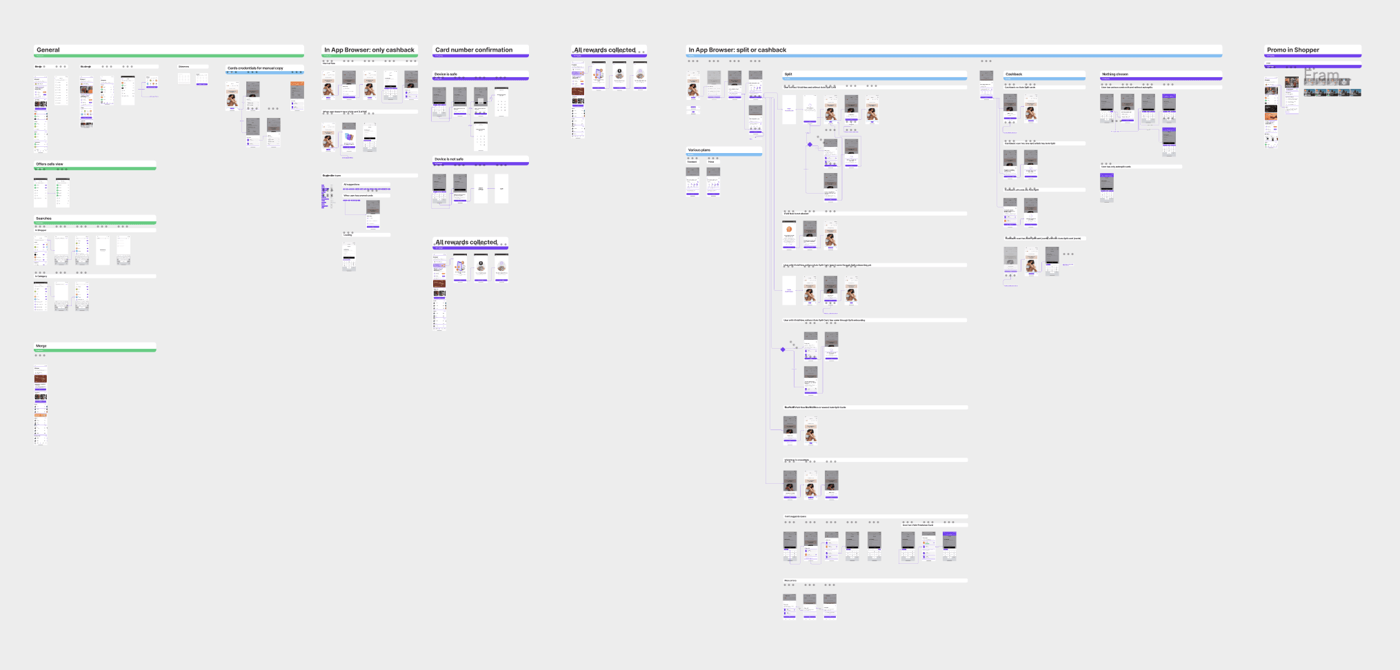
The overall flow contained multiple use cases for various users:
Outcome
6 months
The project timeline.
↑ key CRs
Conversion rates within the in-app shopping funnel.
↑70%
Sum of affiliate purchases.
Next steps
Users had strong preferences among brands. For the next iterations, the team focused on exploring this aspect of users' behaviour.
Reflections
Details are the key. What look and feel should this banner image have? What exactly do we write on a button? Which scenarios mustn't go wrong but probably would? Confetti animation is not waste of time — it is an investment.
To build an efficient UX it is necessary to dive deep into the complexity of the external world: business loops, technical nuances, local people’s unique mentality.
There is no silver bullet for winning the metrics. Just listening to people, having a vision and trying things.
