Solving growth problems of b2b bank with design sprint in Alfa-Bank
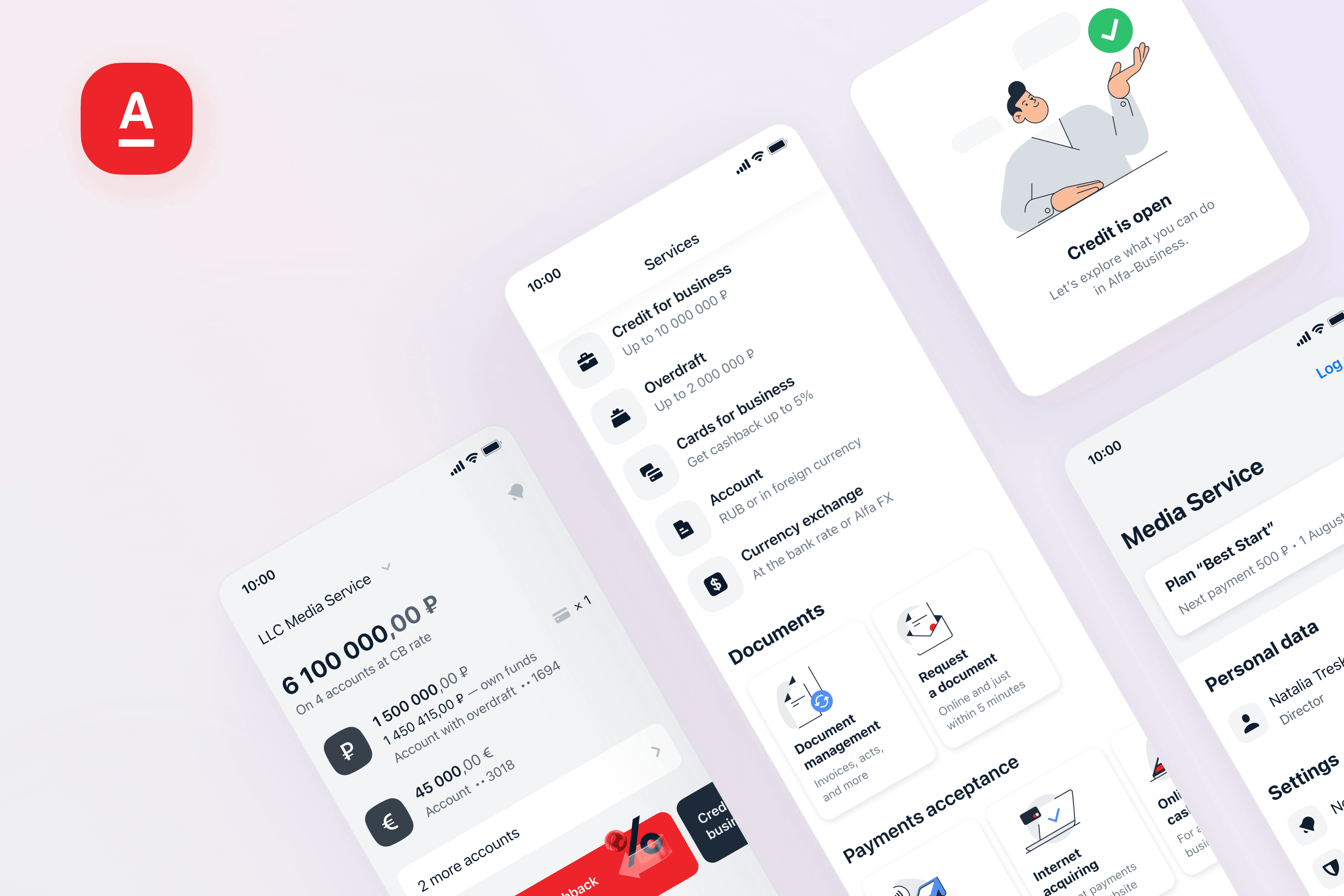
Alfa-Business is a mobile app for business. When I joined Alfa-Bank, the online functionality for business started to grow rapidly. Existing app navigation didn't let product teams add new products and services without struggles. To solve the problem I facilitated a design sprint for the team and introduced a modernised design vision.
Product
Role
Product design lead (5 people in team)
Scope
Product strategy, UХ/UI, user research, design sprint, redesign, leadership, art direction, design system
Years
2020-2021
Platform
Mobile
About company
Alfa-Bank is the largest Russian private bank with 1M+ b2b clients and 22M+ b2c clients. Company's product strategy is phydigital: great digital & offline experiences.
Product & users
Alfa-Business is mobile app for business clients by Alfa-Bank (MAU 250K). The majority of mobile users are business owners or employees in small companies. The most frequent tasks in the app are: checking operations and overall financial status, repeating and signing payments.
Context & problems
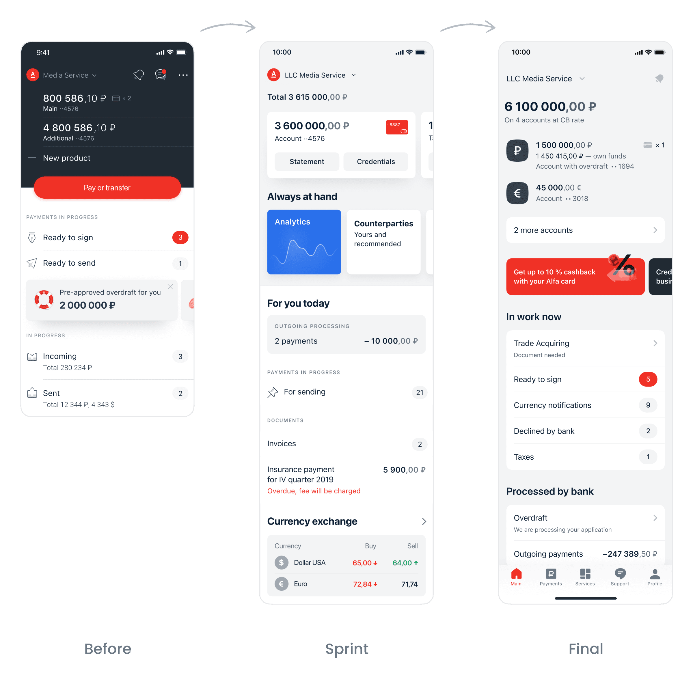
This is how Alfa-Business looked in the beginning:
Product teams were facing the following problems:
Adding new products to the app became tricky. Discussions on the entry points and ways of promo were time-consuming.
There was no established logic for a product lifecycle in the app. For example, a team wants to add a new service "Accounting". How should they promo it? Where should the users see the taxes calendar? How to switch on/off the service?
Alfa-Business looked visually outdated and didn't match with the company design updates. Designers didn't have time to work on UI because of a large product backlog.
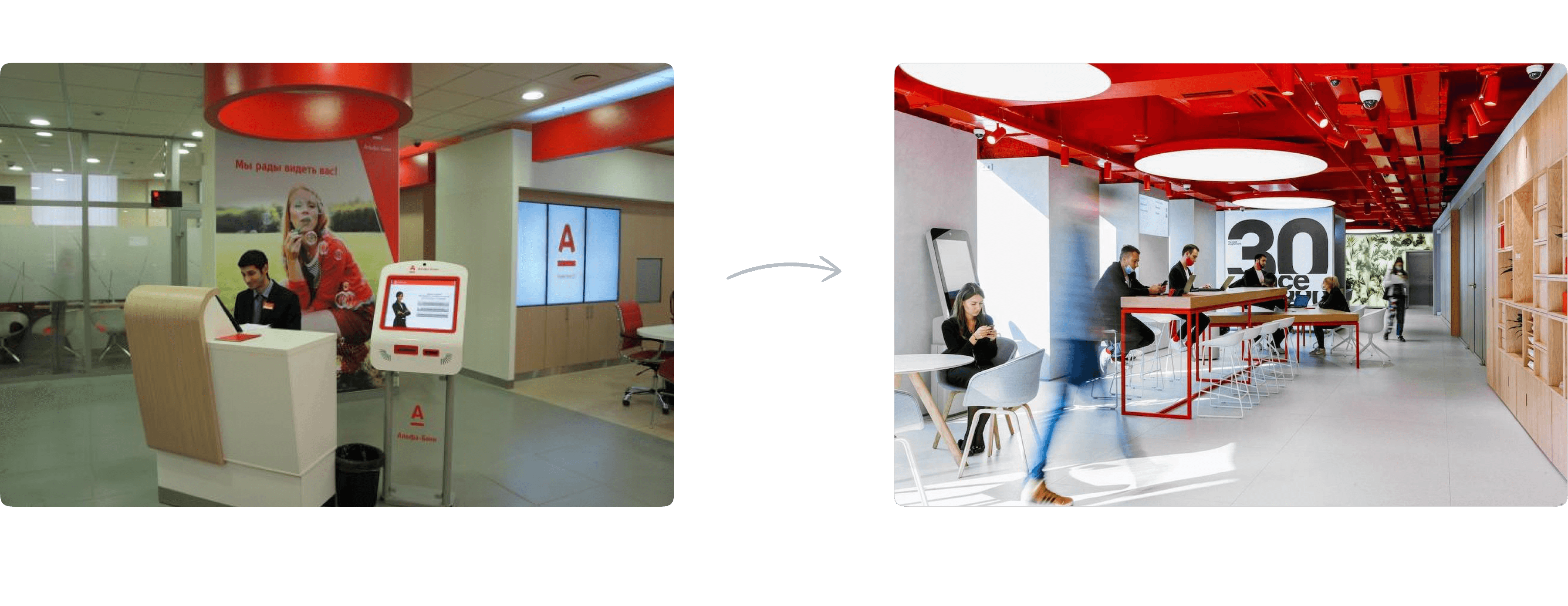
The brand update was huge: Alfa-Bank officially came up with the phygital strategy. Thanks to our stunning marketing team, we were changing dramatically at that time:

The bank offices were changing too and became more modern and digital:
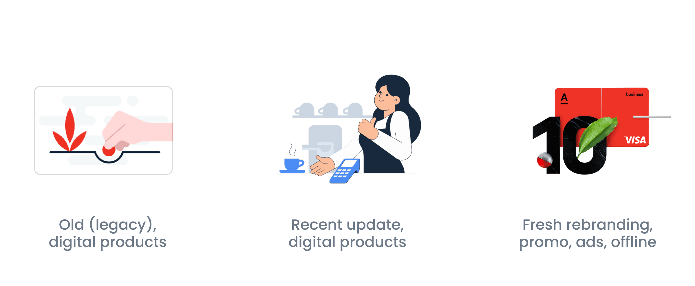
Graphic style varied throughout different channels:
Why design sprint?
The problem of growth at Alfa-Business was broad and potential solutions were expensive. Therefore, it was crucial for all teams to synchronise their visions before planning any actions. Design sprint was the fastest way to do it.
My role
As Design Lead of Alfa-Business I was responsible for the whole process of app redesign regarding existing product problems, from UX to art direction. On this path, I used to combine the work of a manager and an IC.
I initiated and conducted the design sprint. Alongside with the Design Director of b2b, I was responsible for the sprint facilitation.
Sprint
Preparation
The preparation started with synchronising the high-level sprint goals with Alfa-Business CPO and the Director of b2b digital department:
Create principles of app navigation regarding existing business plans.
Collect major entry points in one place.
Collect key conversion scenarios.
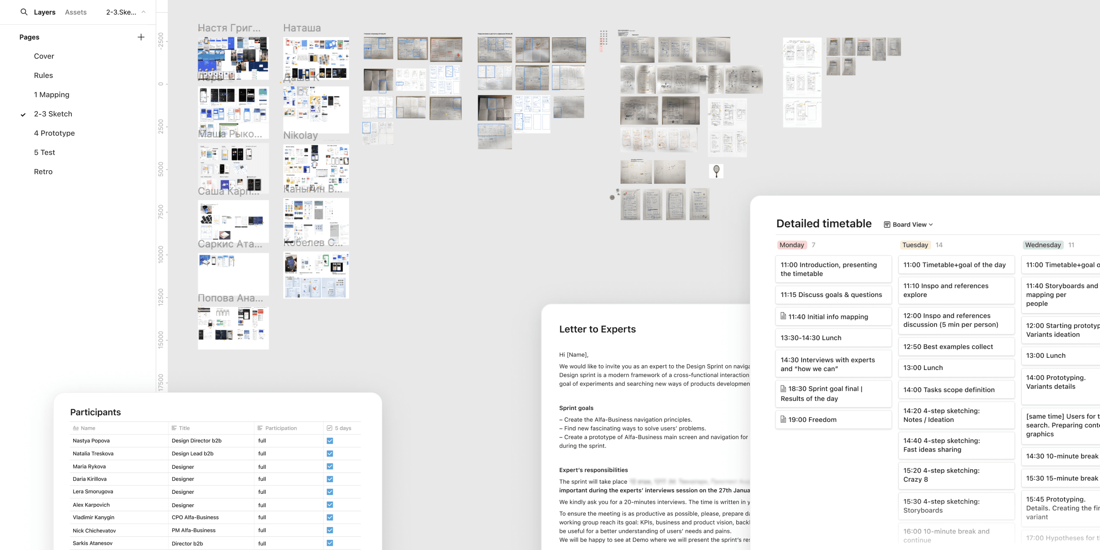
How it was
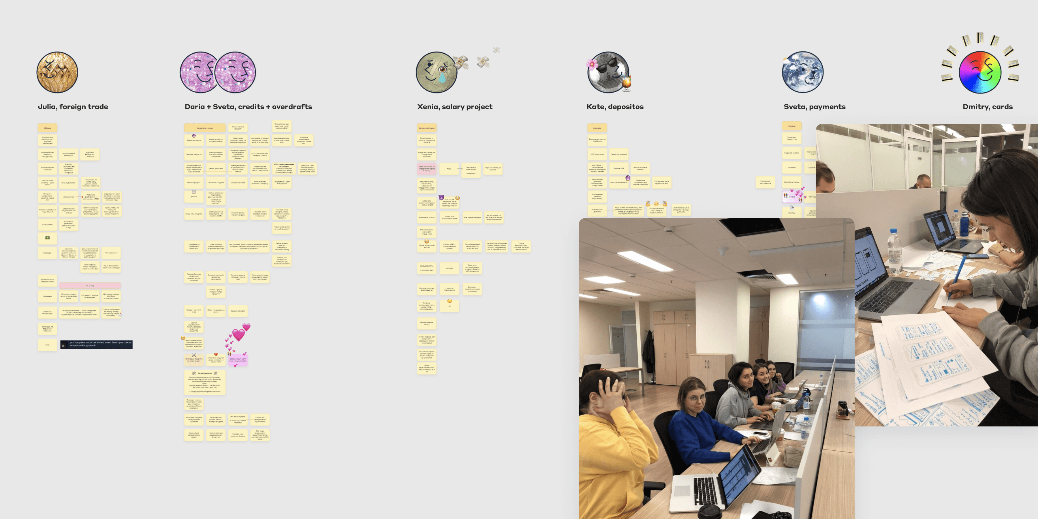
Some great designers and product people from Alfa-Business.
Day 1: Data collection and goal setting. All PMs shared plans and issues related to their products in Alfa-Business. We had written down everything they had been saying, without paraphrasing.
Day 2: Individual brainstorms on paper. The goal was to generate as many ideas ideas as possible. No design systems, only new ideas. One of the most memorable exercises was Crazy 8: participants had to draw 8 different solutions for a task, a solution per minute.
Day 3: Teamwork and picking a solution. We picked the final solutions for detailed work. Again, we didn't limit ourselves by existing design system. An essential decision was the transition to the tabbar navigation. Although this solution seemed logical since the beginning, I wanted to check if it really could solve the product's initial problems.
Day 4: Prototyping. The prototype consisted of two branches as we wanted to test our solution for different combinations of data and types of companies.
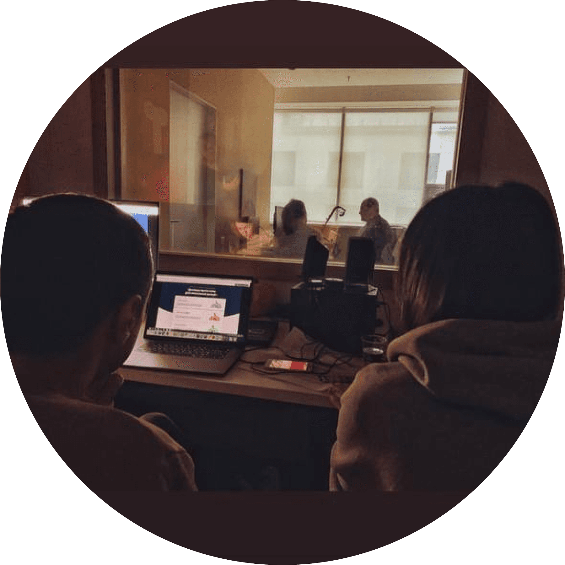
Day 5: User testing. We conducted usability tests with 5 respondents and gathered feedback.
During the sprint the design team experimented with fresh updates from marketing: new font and 3D illustrations. We experimented with style in general and were having sooo much fun.
The most amazing phrase from a respondent was: "How can I download this app version?"
Sprint results and further actions
I pitched the sprint results to the Director of b2b digital and the CPO. We agreed with the following statements:
We started the sprint because of the product growth issues. However it turned out it was impossible to avoid reviewing the whole navigation in general.
Although the feedback from clients was mostly positive on Day 5, we still needed to provide a more detailed research to create a holistic solution for service problems.
This all meant, that we needed more time and resources to continue. Thanks to the impressive sprint results, we got them.
As a result of a successful design sprint, a redesign team of software engineers was formed. To manage the redesign process, I initiated a weekly sync with the CPO and 2 designers.
My main responsibility was to
"make things happen".
Dive deeper
During the first redesign meetings we decomposed the app structure into several parts and started to work on them step-by-step: products and services; company and user information; settings; payment documents; main screen; etc.
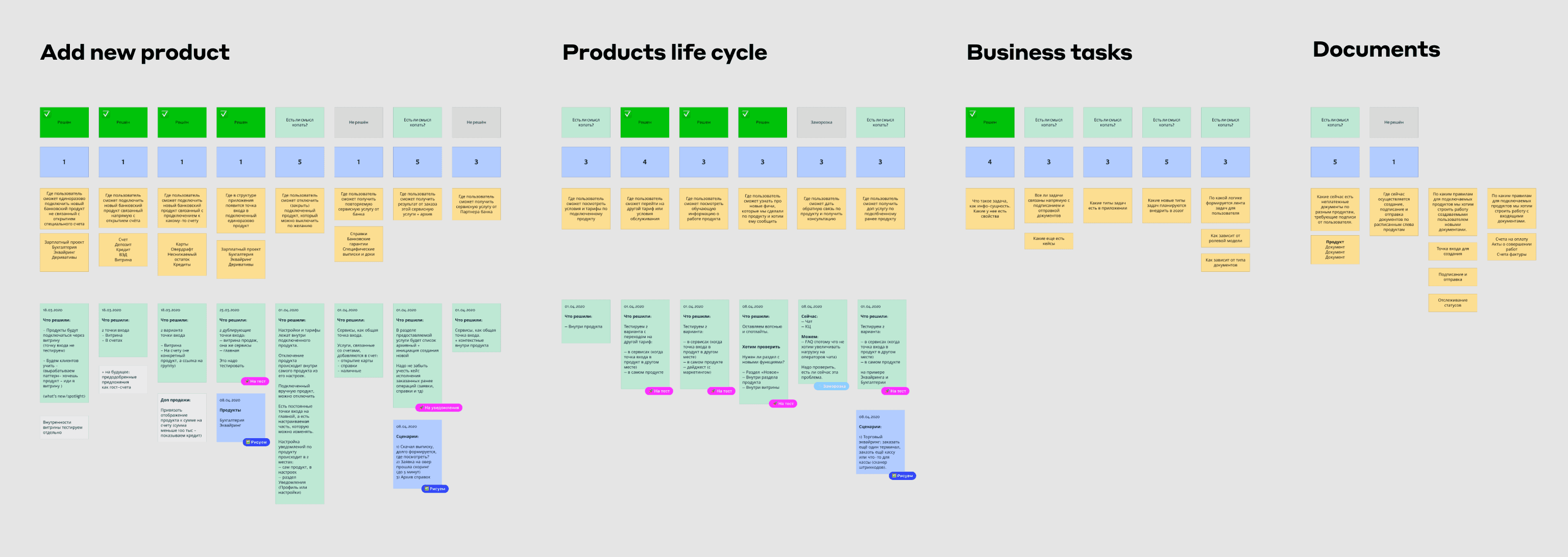
Each card is an issue for further discussion before proceeding to layouts. After each card analysis, we conducted an appropriate type of research to test our hypotheses.
Navigation
The first big change was the transition to tabbar navigation. This change might seem tiny, but in reality we had to review all screens to avoid bugs, especially in multiple-steps-applications.
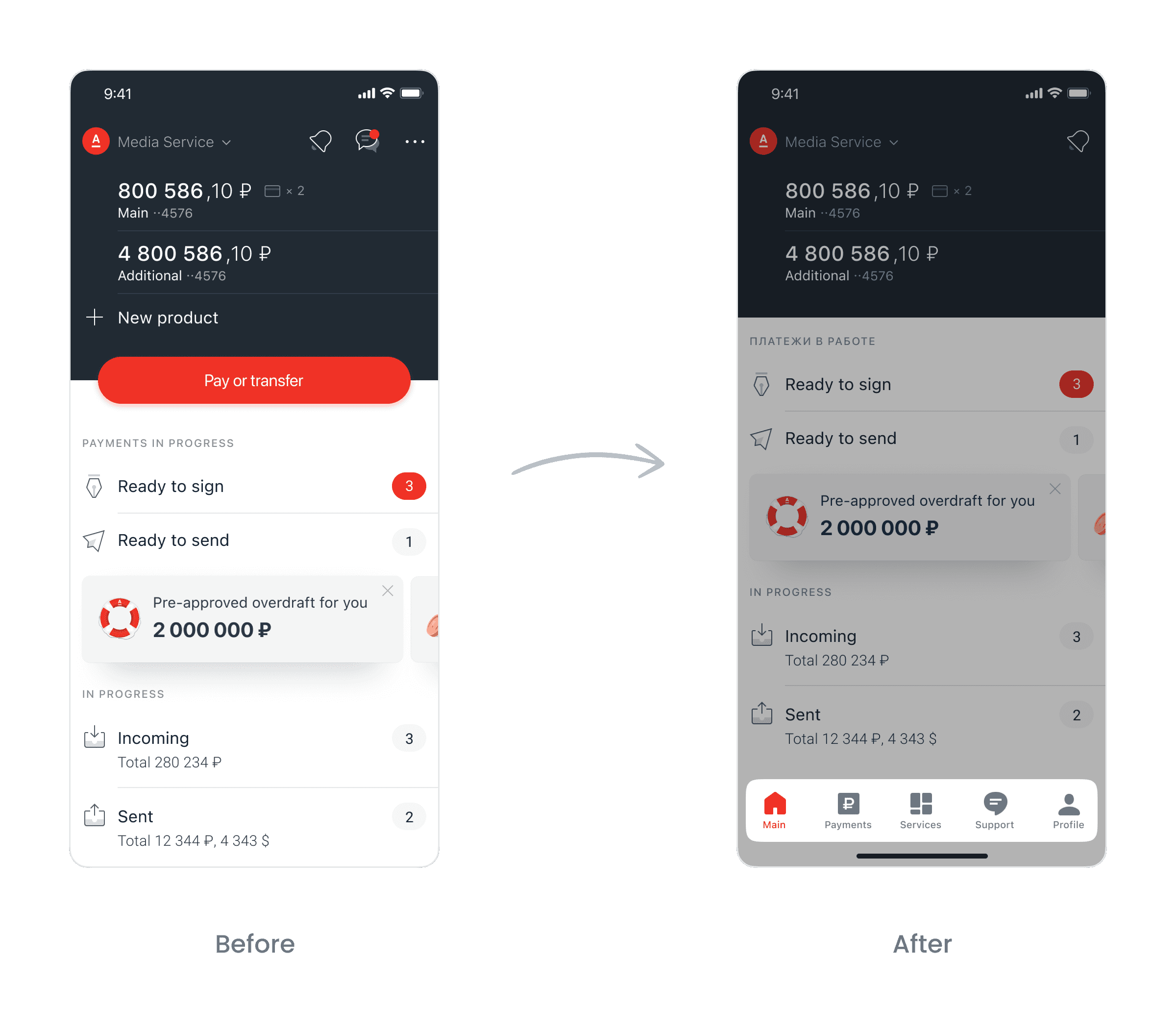
Products and services
High-level screnarios included:
✧ 1
Add new product.
✧ 2
Lifecycle of product.
✧ 3
Product status review.
✧ 4
Actions with and inside products.
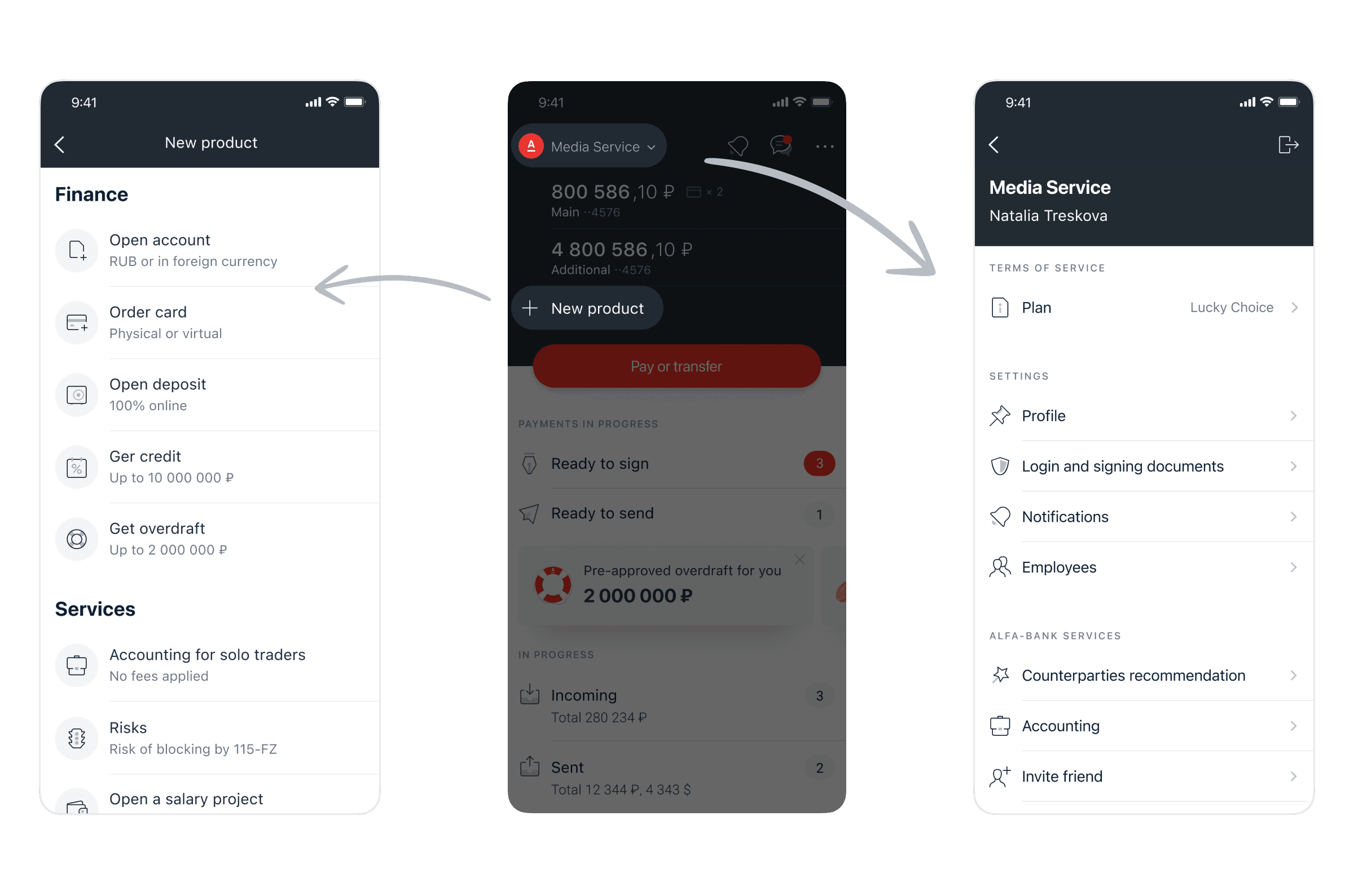
Initially, the app had a section called "New Product" with a list of products. Also, some of bank services were located in "Profile" section.
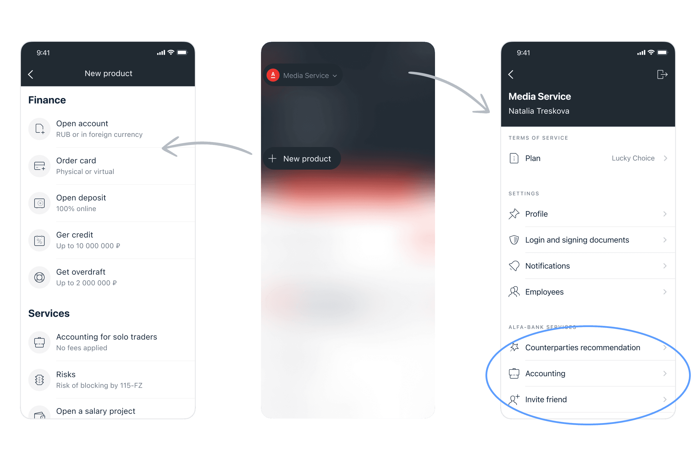
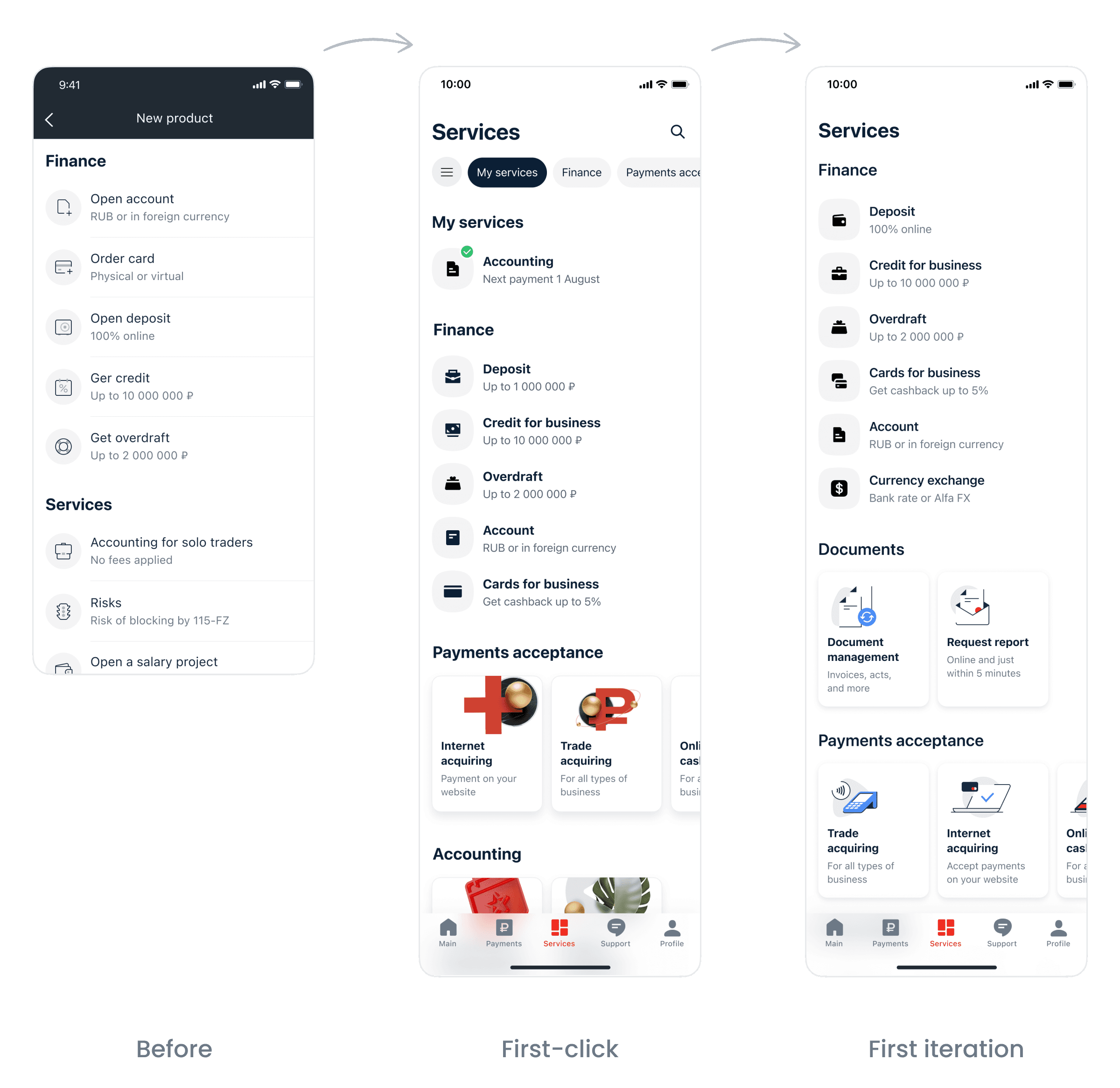
We decided to merge all products and services into one section. Within a week the redesign team was generating variants. As a result, we gained two approaches:
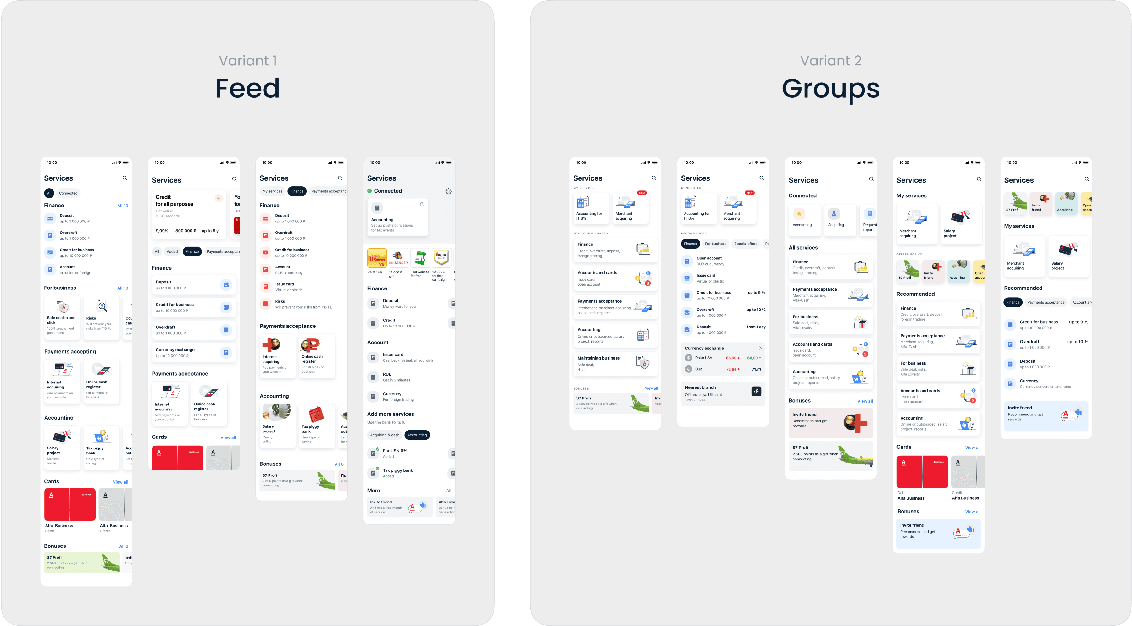
Feed: lists of products on the 1st screen. Groups: products grouped on the 1st screen.
The design sprint variant was not forgotten too. However, after the deep analysis of existing services, the sprint variant turned out to be simplified.
For the first-click test, we prepared a hybrid-variant with both groups and feed. The logic was: simple cells for the most popular products and groups/cards for products which are more specific.
During the test some respondents were frustrated by the switcheable on/off products. For example, let's take "Accounting". There is a tax calendar, should it be placed on the main screen or in "Services"? As the main screen update had been planned later, the first iteration of "Services" lacked this logic and was simple but efficient.
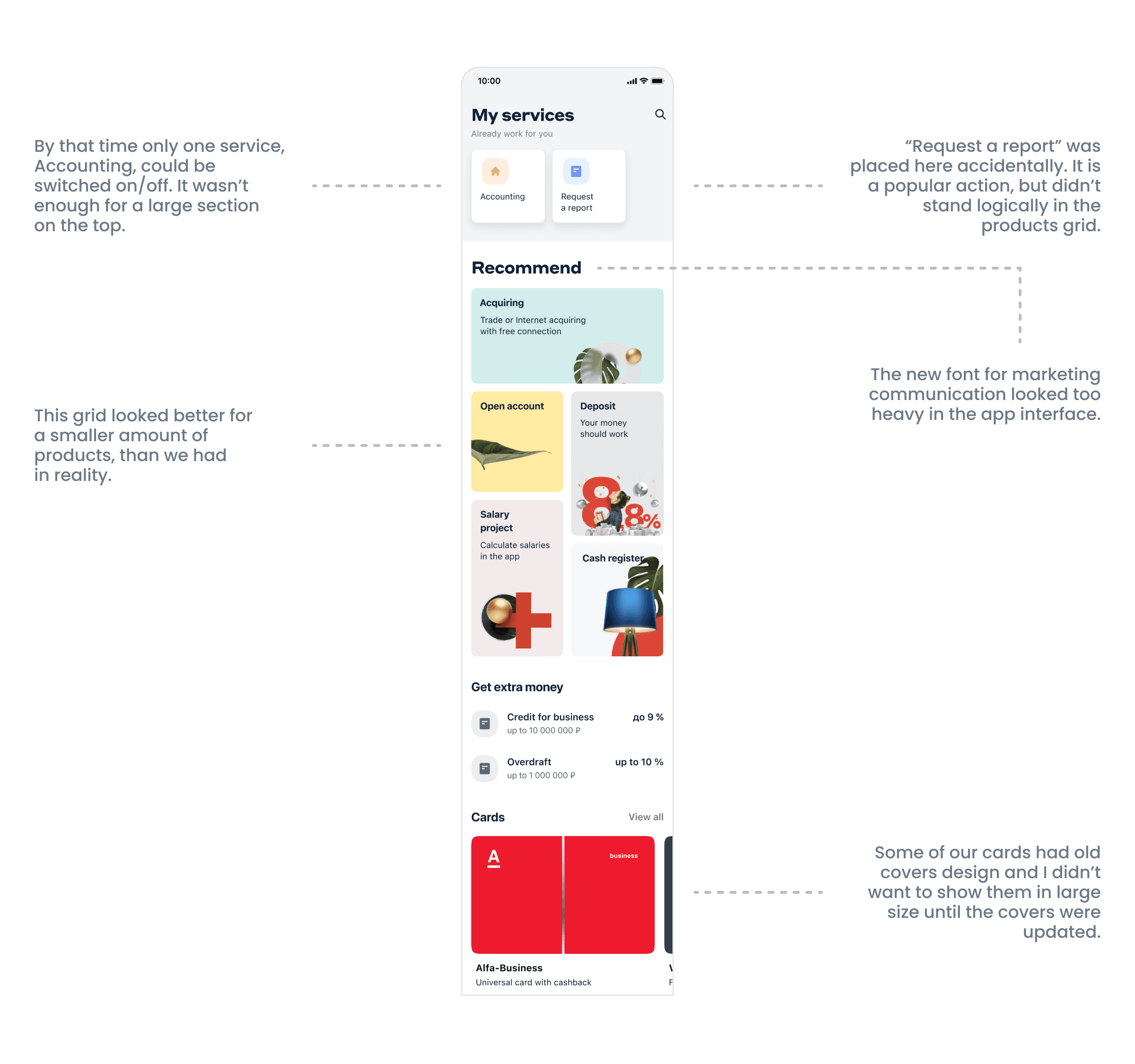
One of the questions was: what type of illustrations to use? Current app illustrations were calm and flat, while folks from marketing were experimenting with bold 3Ds. Although the 3Ds looked cool in promo-s and merch, they didn't work well in the app and needed customisation for mobile sizes. I decided not to wait until the illustration set is ready and to launch first iteration with current illustrations. Honestly, if we agreed to wait, we would probably never move forward.
Profile and settings
Unlike b2c, b2b clients have 2 types of settings and data in their profiles: person and company. The question was which one is more important.
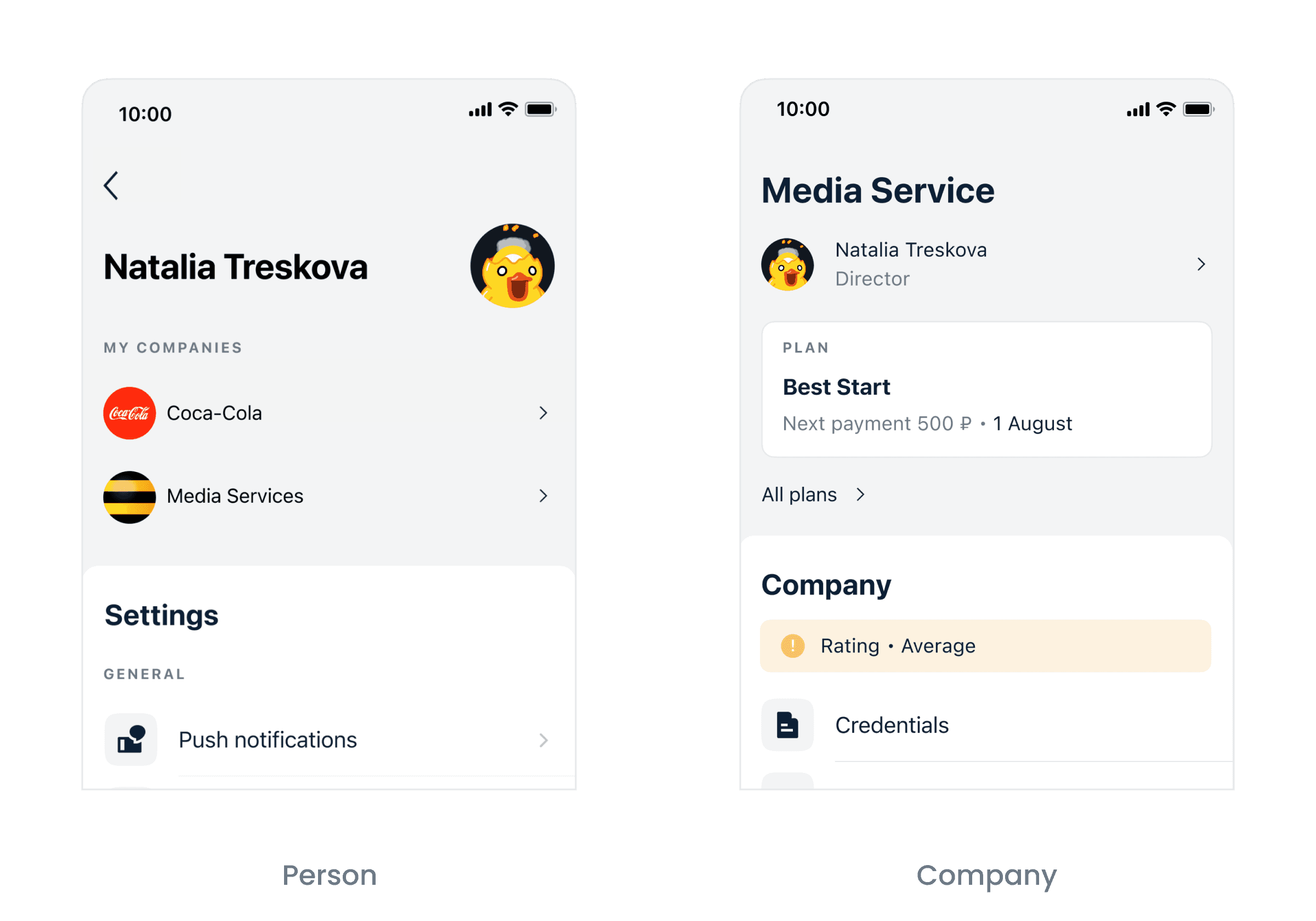
I gathered information about companies' logos and users' avatars from the clients' interviews base and found out:
Companies rarely have nice logos.
Employees talked about their company's logo only in terms of signing documents.
A user's account is often a role. It means that multiple people may use one account and there is no sense in uploading an avatar picture of a person.
To sum up, there were no cases when users needed or wanted to upload avatars or logos on the profile screen.
After the first-click test we came up with a final version.
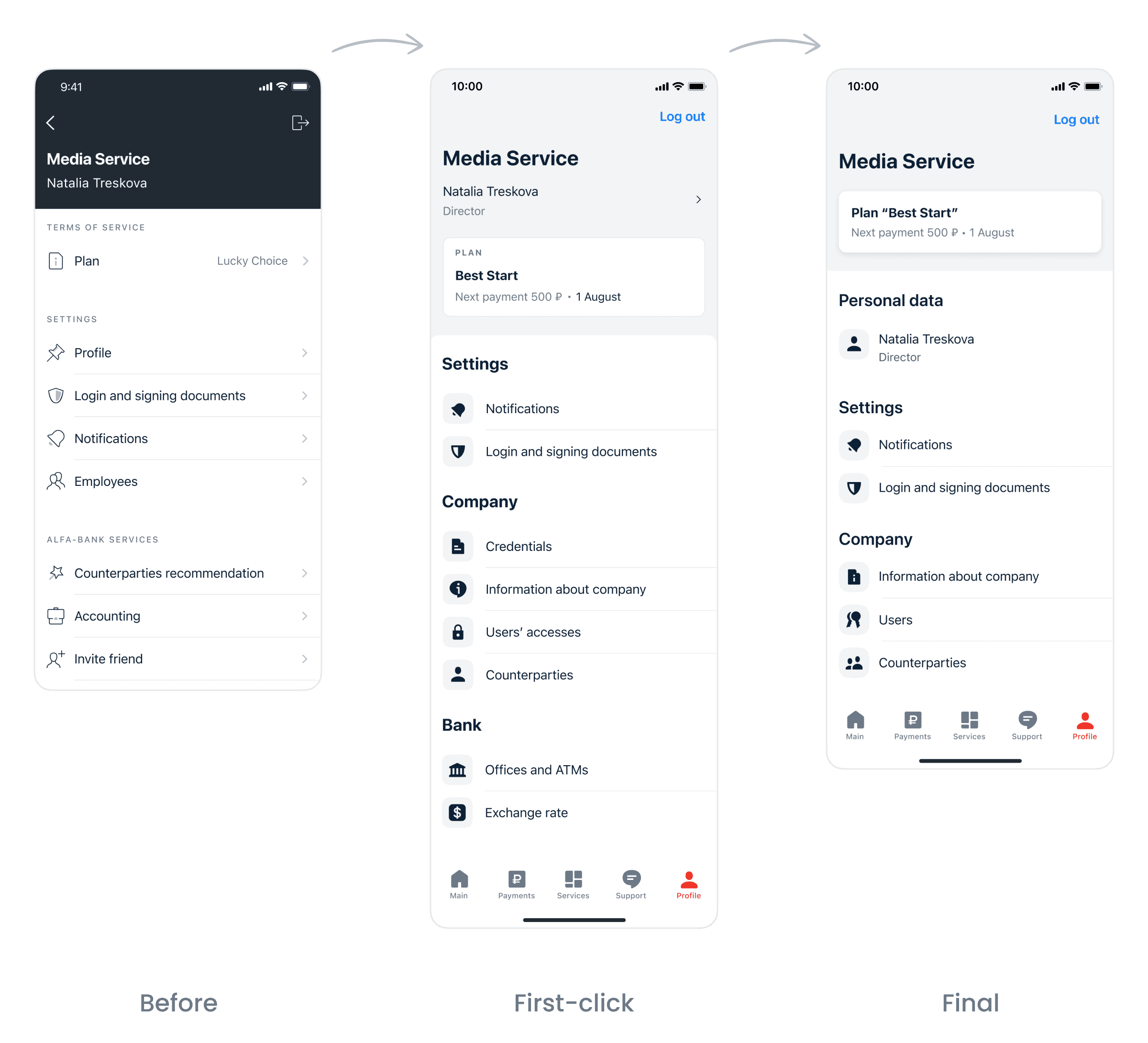
Some insights from the test: the difference between "Credentials" and "Company information" was not clear, so we combined them together into "Information about company". Respondents were also frustrated by the "Bank" section and we removed it from the final version.
Main screen
After a number of iterations and a broad analytical process the redesign team came up with the final version of the main screen.
Outcome
Product growth system
The main outcome was that the work on redesign became systematic and official. It means that product teams will get better instruments for implementing new features and our clients will faster get better UX.
3 months
The app navigation was switched to tabs.
Redesign team
A new engineering team was formed for the redesign purposes.
Reflections on design sprint
Design sprint is a fantastic framework for certain types of activities. However, there are several nuances which should be taken into account in advance.
Team fun without borders. Our collection of memes got a few new pearls.
Work on a large design challenge which can't be overcome by one team.
Collecting the data and analytics very fast.
Going beyond the daily routine and search for non-trivial solutions.
Opportunity to effectively pitch an idea to stakeholders. Artefacts and test results instead of meetings and words.
Design sprint might be a stress for the participants. Tough timing and large amount of new information.
Final solution can be too simplified, especially in complex products.
High probability that the sprint solution won’t be implemented because the task is not at anyone's backlog in the beginning.
For b2b products: it can be difficult to find proper respondents for test.
